Data Visualization & Data Storytelling Training | In-Company Workshop for Teams | On-site in Europe & remotely
Learn how to visualize and communicate data effectively
Enable your teams to visualize and communicate data with confidence using standard Excel and PowerPoint.
In this interactive training, we develop strong design and storytelling skills: how to choose the right visualization for your data, design charts that are easy to understand, and turn numbers into clear, meaningful stories that foster insight and better decisions.
Overlapping bar chart showing how one value is an inherent part of another (plan vs. actual).
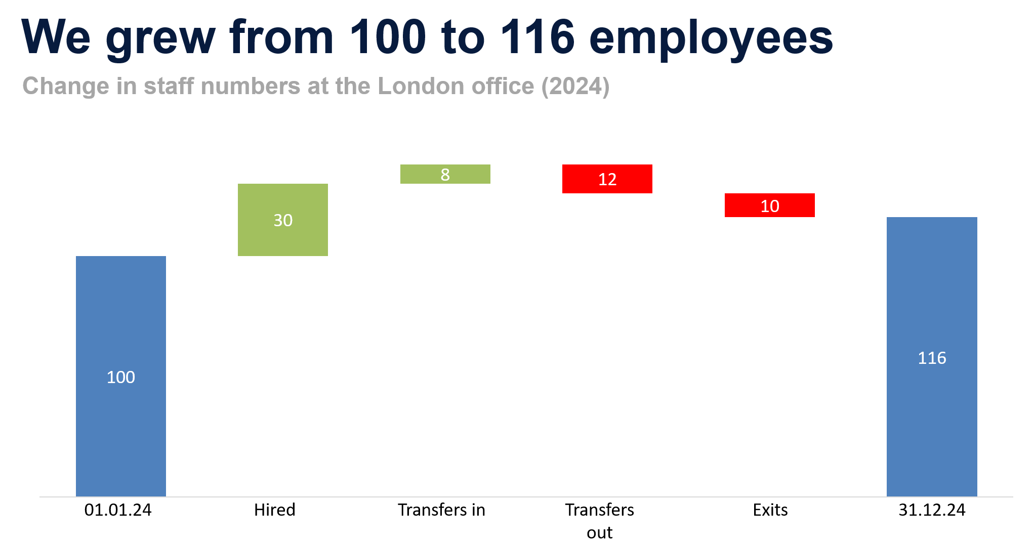
Bridge chart showing the components of change between start and end value.
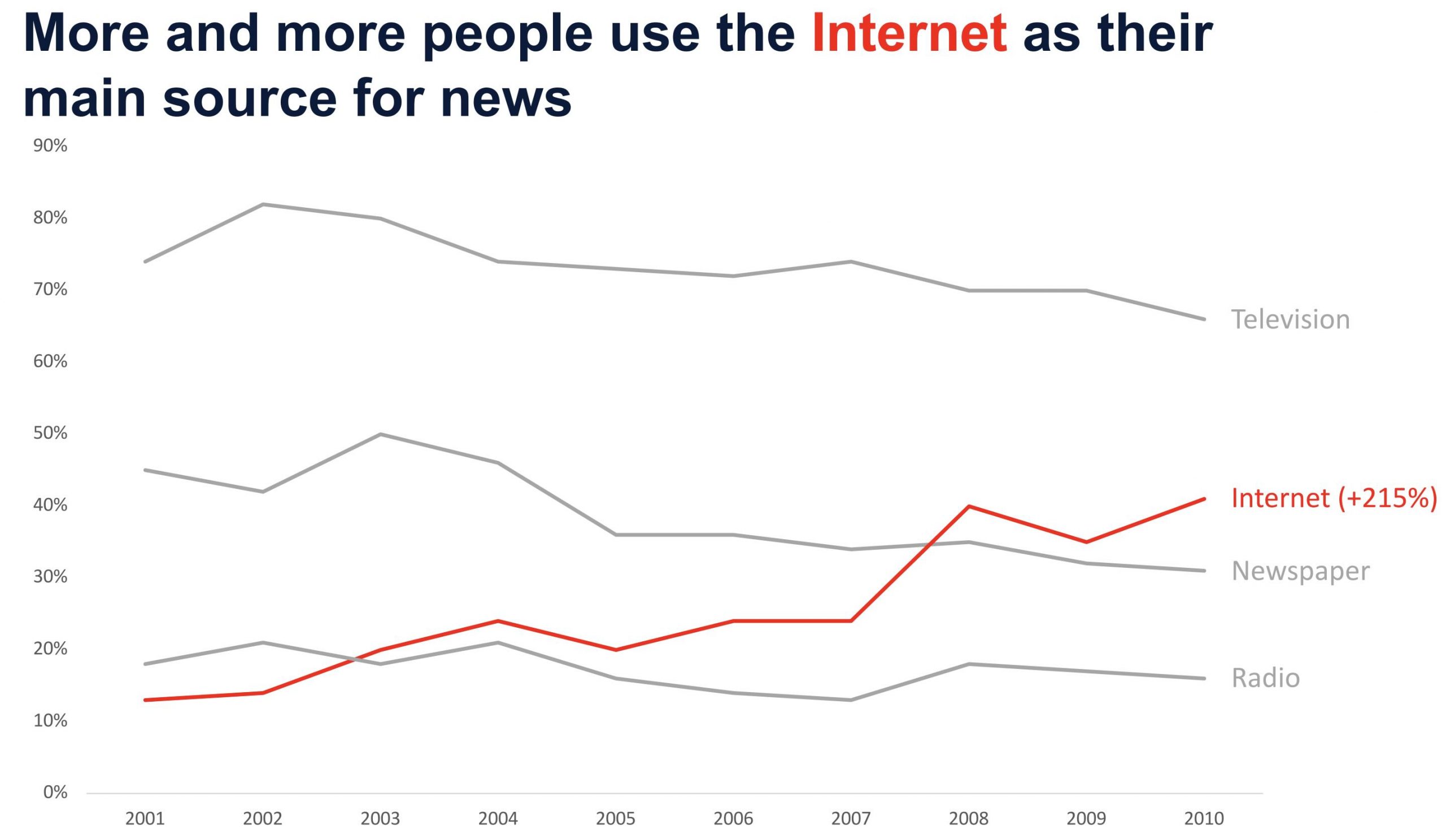
Line chart using an accent color, contrast, and the Gestalt principles of proximity and similarity.
About Our Workshop: Data Visualization & Data Storytelling
In this interactive workshop, participants learn core Gestalt principles that enable them to create charts that are easy to understand and to tell a compelling data story. Step by step, participants learn how to turn data into clear, purposeful visualizations that support effective communication and decision-making. They learn which chart types work best for different data sets and business questions and build a series of out-of-the-box visualizations tailored to real-world use cases.
The workshop is highly interactive and practical. Participants work directly on their own computers and create effective visualizations using standard Excel and PowerPoint — no additional tools or software required.
Throughout the workshop, a broad range of chart types is covered, including benchmarks, bridge and waterfall charts, overlapping bar charts, area charts, heatmaps, histograms, dot-line charts, slopegraphs and more.
Workshop Agenda
(Available Formats: Flexible up to 6 Hours)
1. Psychological Foundations of Visual Perception
- How people perceive, process, and interpret information
- What makes data easy—or difficult—to understand
2. Core Gestalt Principles for Effective Slide Design
- Principle of Proximity
- Principle of Connectedness
- Principle of Similarity
- Principle of Region
3. Choosing the Right Chart Type
- How to select the most appropriate chart for your data and message
- Matching chart types to analytical questions and communication goals
4. Data Visualization Examples and Hands-On Exercises
- Visualizing before-and-after comparisons
- Showing distributions
- Highlighting contrasts and differences
- Displaying developments over time
- Comparing large and small values within a single chart
5. Advanced Chart Types
- Dot plots
- Integrated / overlapping bar charts
- Benchmark charts
- Histograms
- Waterfall and bridge charts
- Gantt charts
6. Simple Data Storytelling Techniques
- How attention works when reading charts
- Guiding the viewer’s focus through visual cues
- Building a clear narrative across data-driven slides, using a theatre technique that reveals information one step at a time

Data Visualization & Data Storytelling Trainer
Your trainer for the Data Visualization and Data Storytelling workshop is SkillDay founder and CEO Joern Steinz (MBA). He brings over 15 years of professional experience as a consultant at Accenture and as a manager in corporate development at XING AG and the freenet Group, where he developed and applied data visualization skills on an almost daily basis to support management and strategic decision-making.
Joern Steinz is an MBA graduate of the EADA Business School and has been delivering inspiring, practical, and effective business training programs since 2014. As founder and CEO of SkillDay, he supports teams and leaders across Europe in communicating complex information clearly, visually, and convincingly.
His references as an in-company trainer include Allianz, Audi, Bayer, EDEKA, Porsche, and more than 300 additional companies. His workshops are rated on average 4.9 out of 5 stars by participants.
Inquiry & Contact
+491755664329


